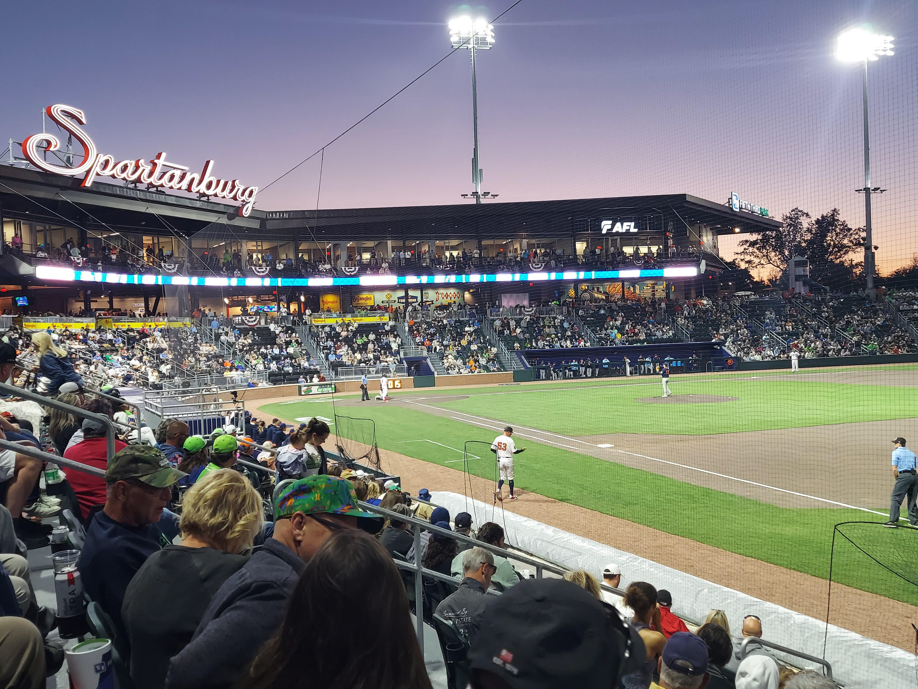
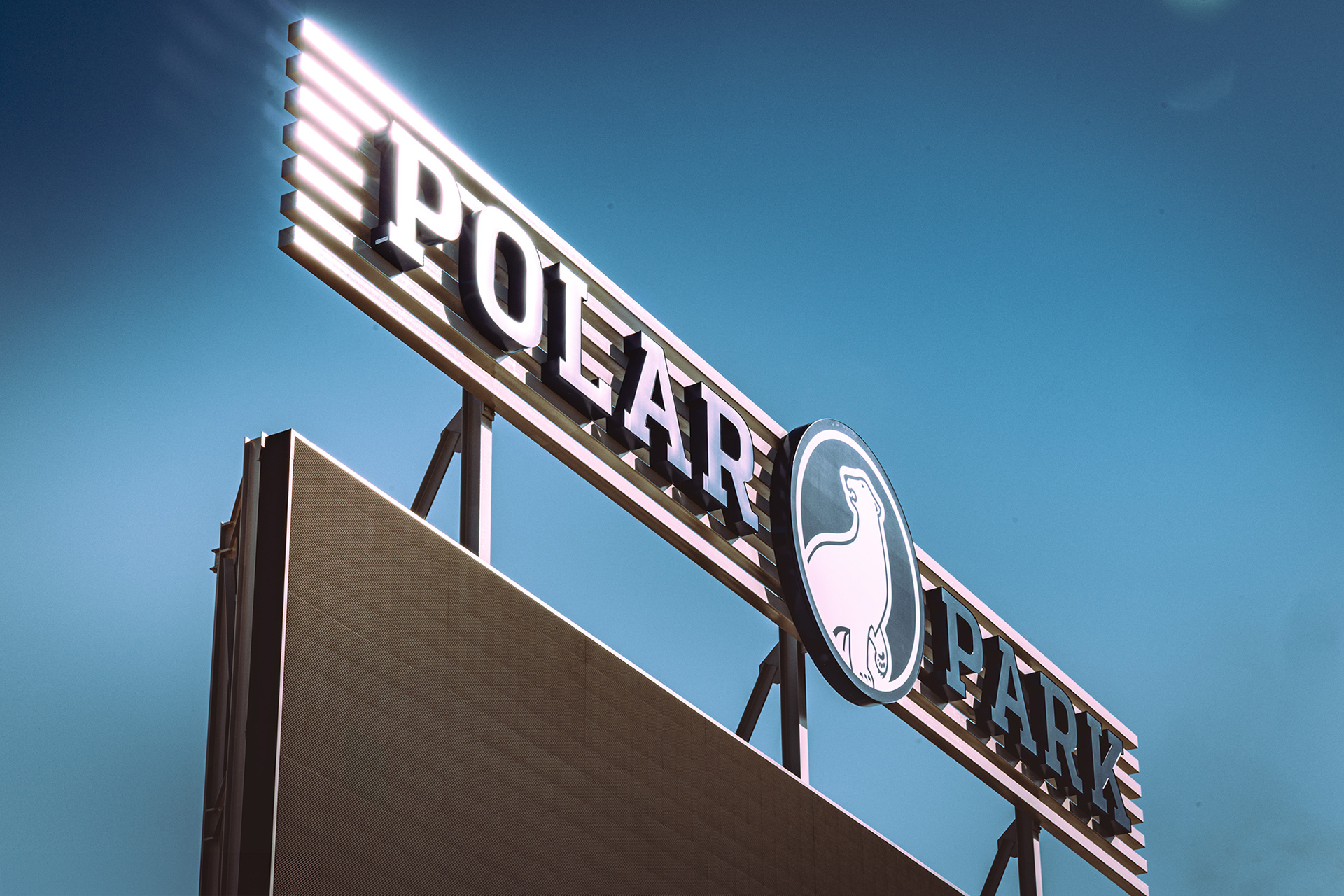
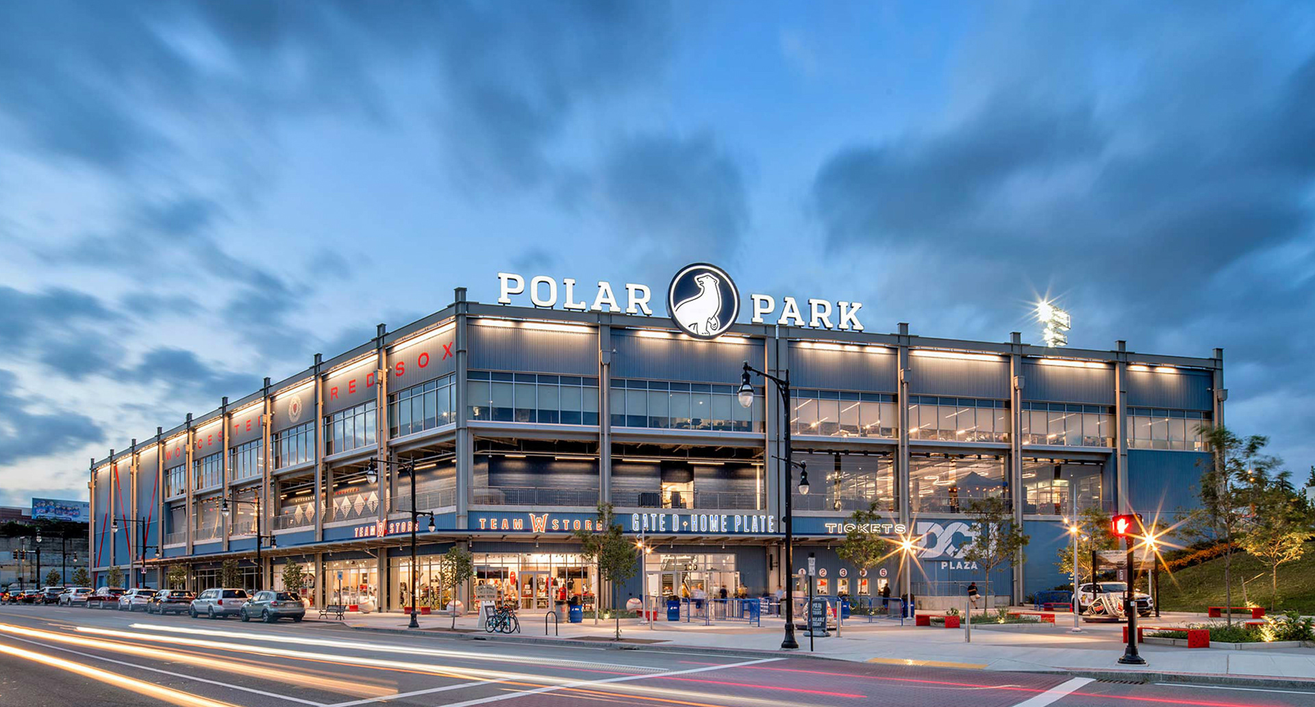
Polar Park Stadium Branding
Working collaboratively with the design team, I led the development of the visual identity for this brand-new stadium at its inception. Polar Park serves as the home for the Worcester Red Sox, the Triple-A affiliate of the Boston Red Sox. I established the primary brand standards and the shield logo, working within the Polar Park blue and white color scheme to create a cohesive identity for the facility.
While I started with an existing slab-serif typeface, I manually adjusted the serifs and letterforms to make the proportions work perfectly for large-scale environmental use. The final results show how these brand standards translated into the physical space. While the senior designer handled the fabrication and signage details, I focused on the logos, brand marks, and the concessions that defined the stadium’s visual character.
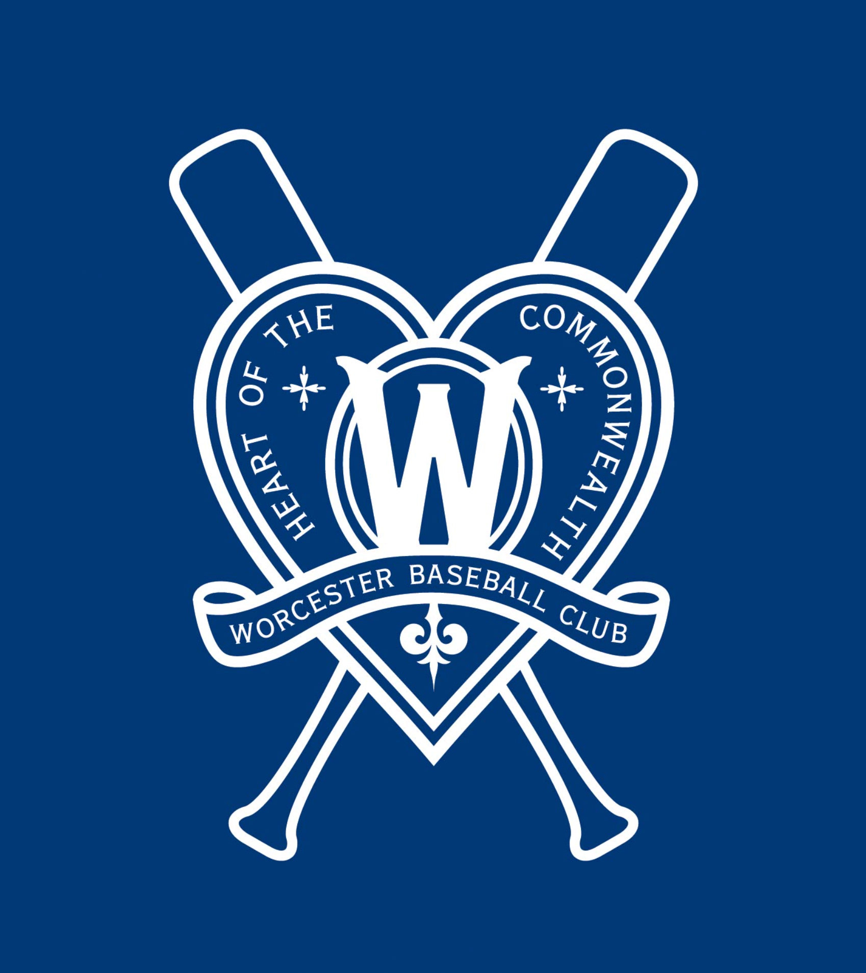
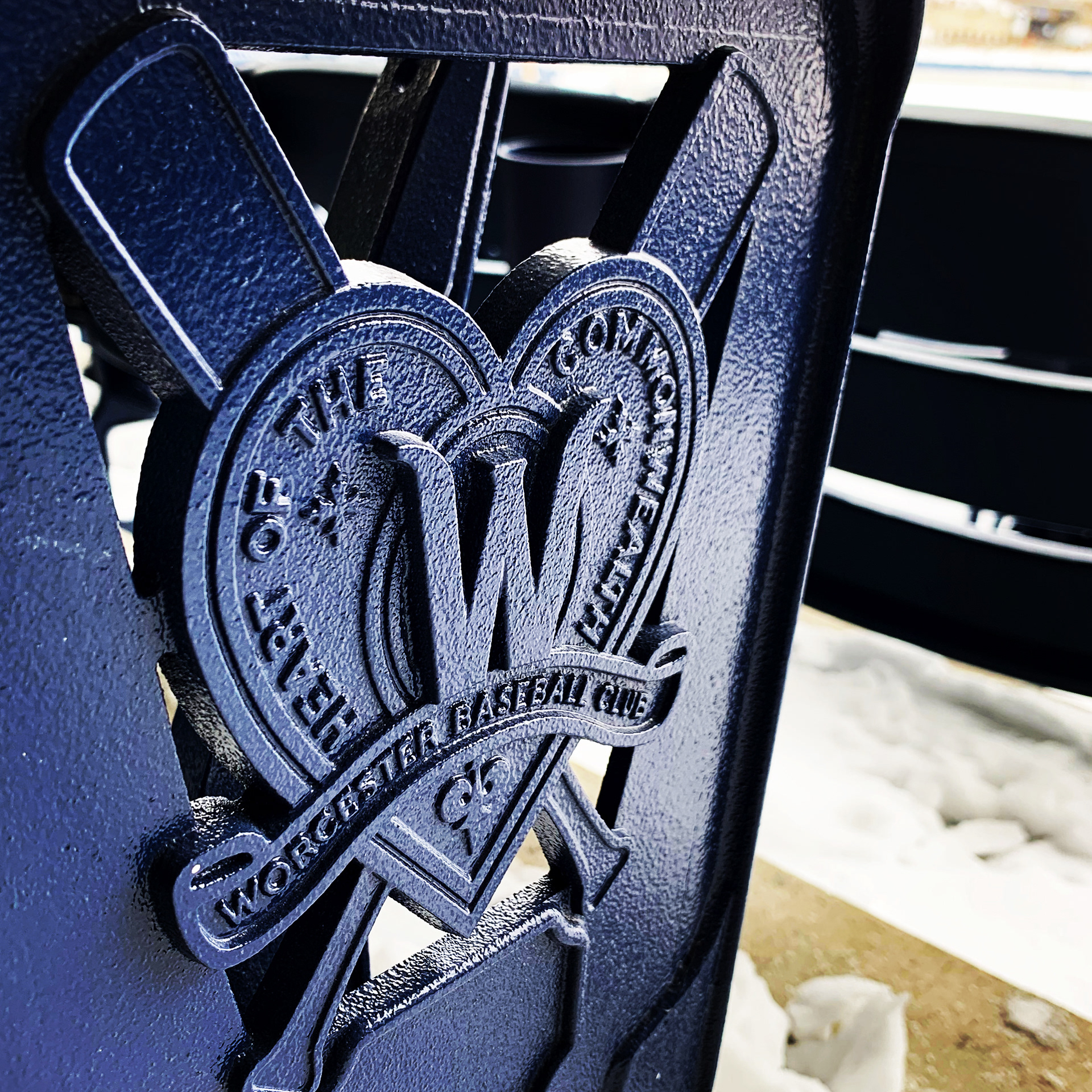
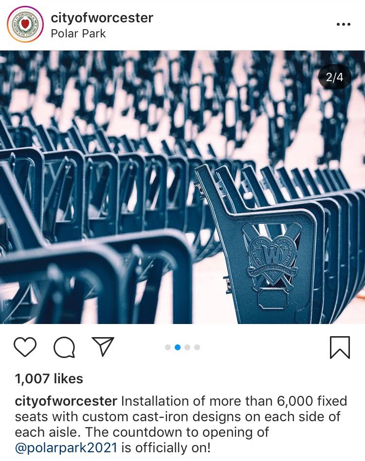
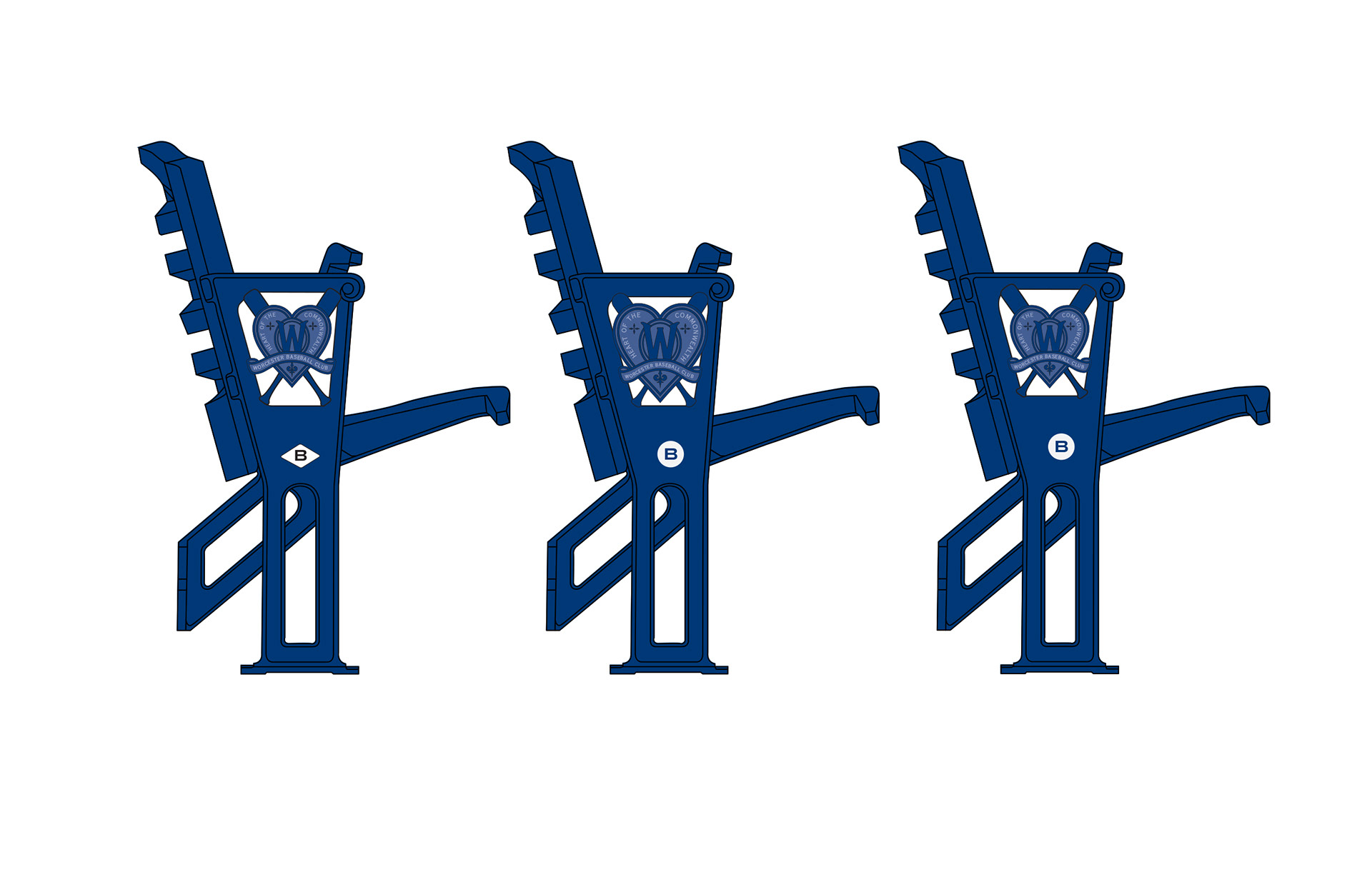
Custom Cast Seating Insignia
This insignia was developed for the stadium’s cast iron seat ends, inspired by historic Worcester baseball ephemera. I designed the final composition as a completely custom piece.
I manually drafted the central "W" from scratch to achieve a unique character that wouldn't feel like a standard font. I also selected the copperplate typography and created the vintage-inspired flourishes below the ribbon to capture the site’s historical context. Every point and curve was built to guarantee the design translated perfectly into dimensional form.
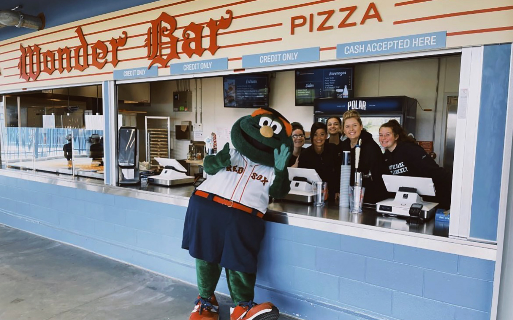
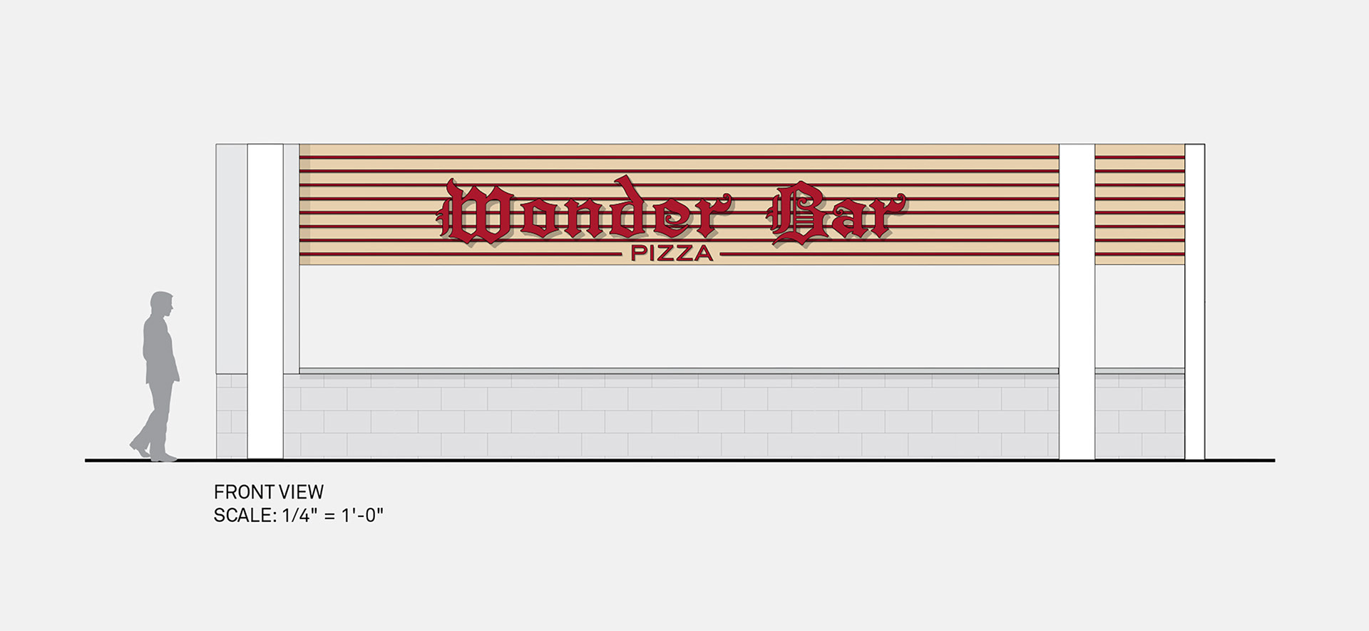
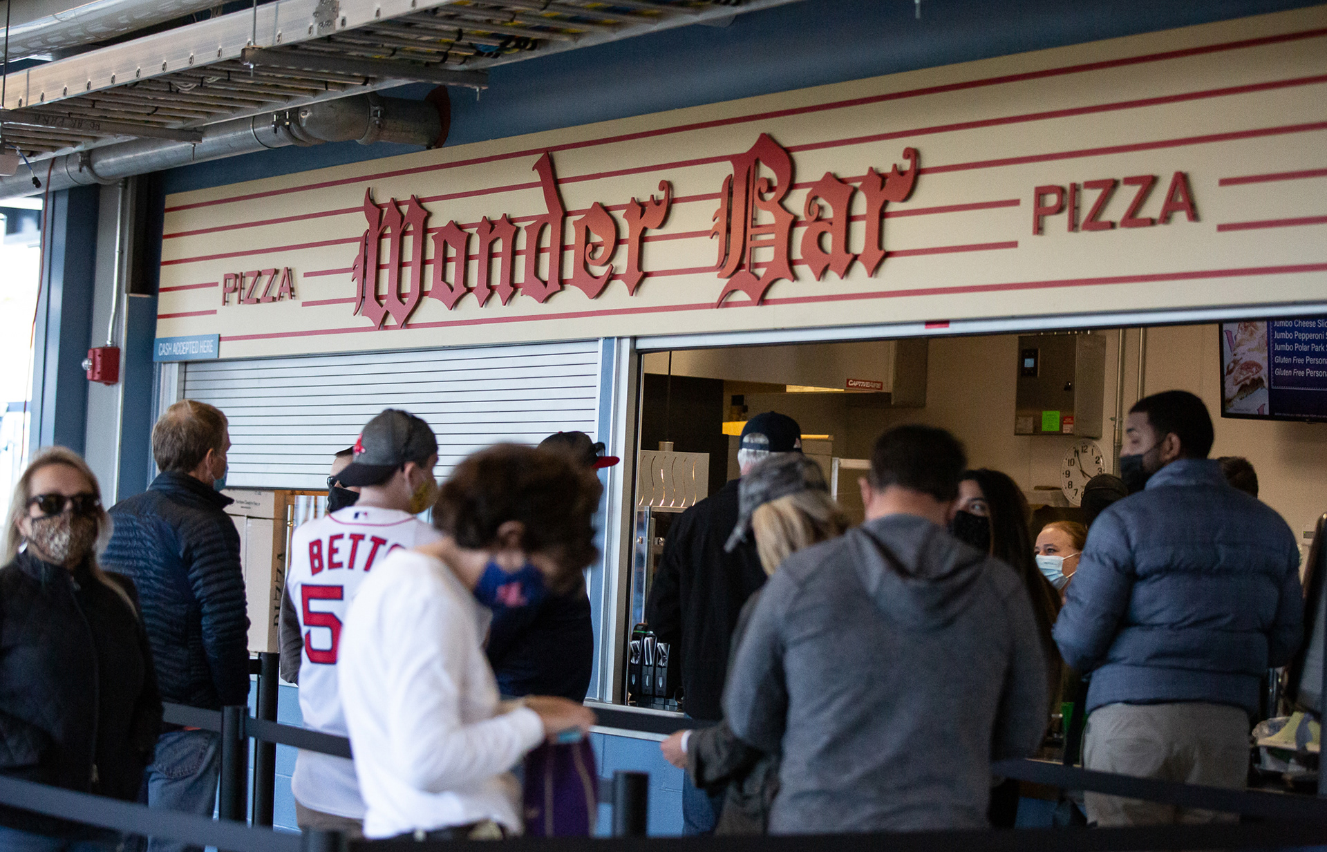
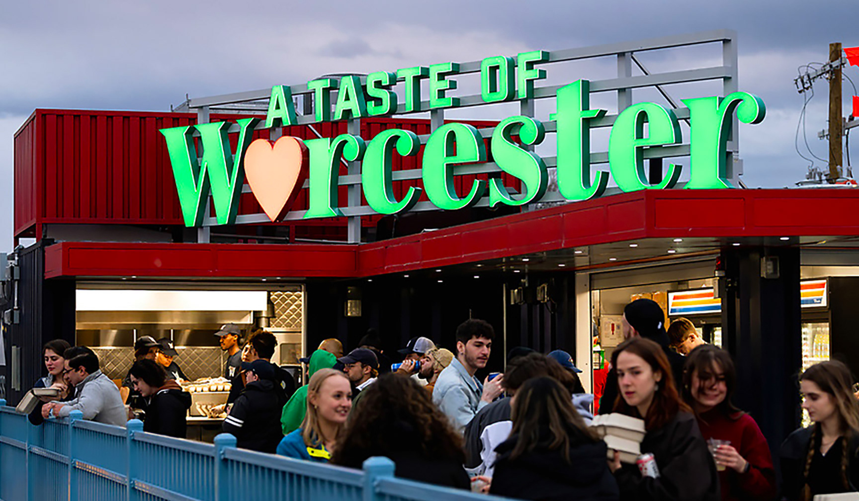
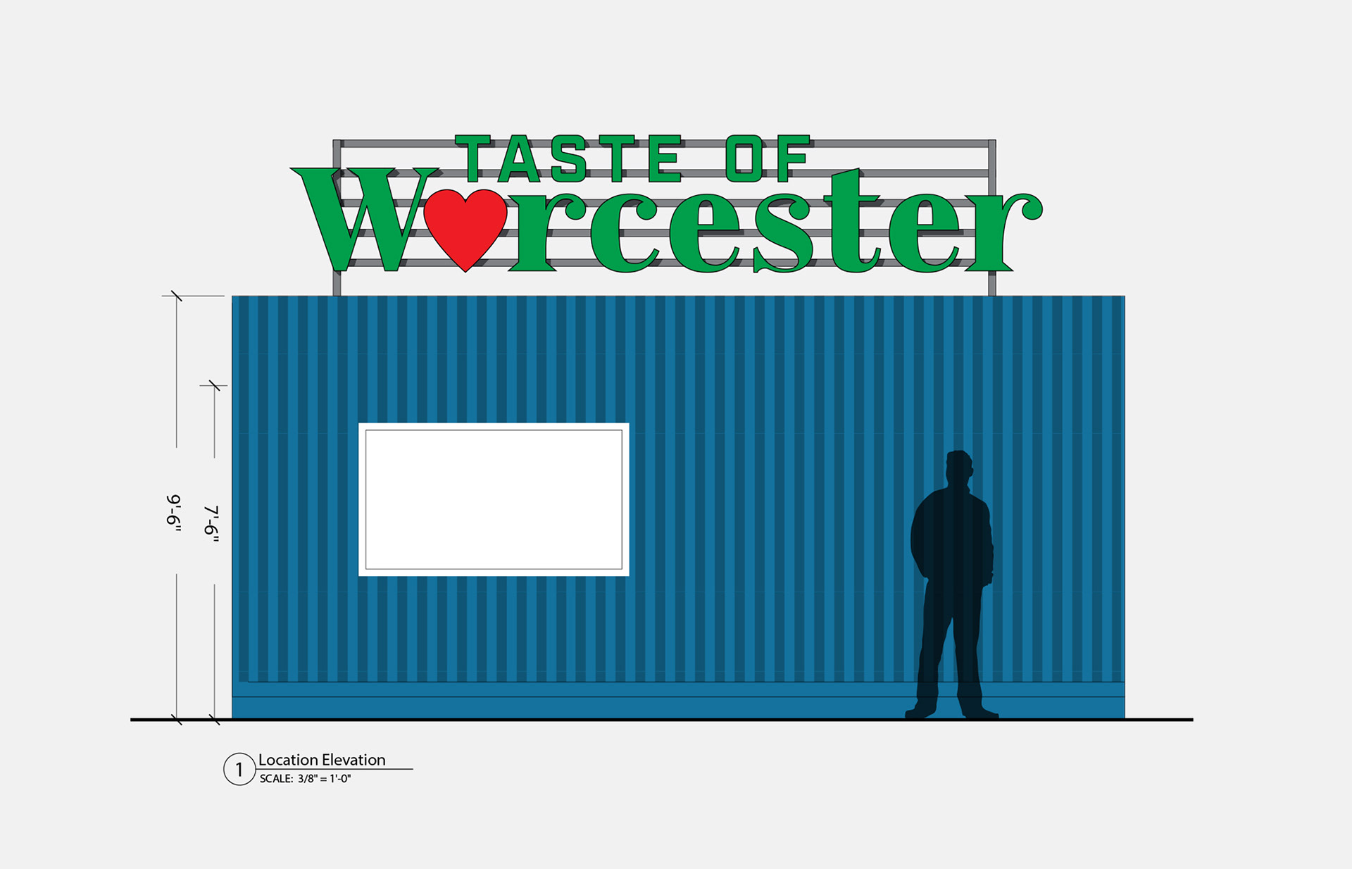
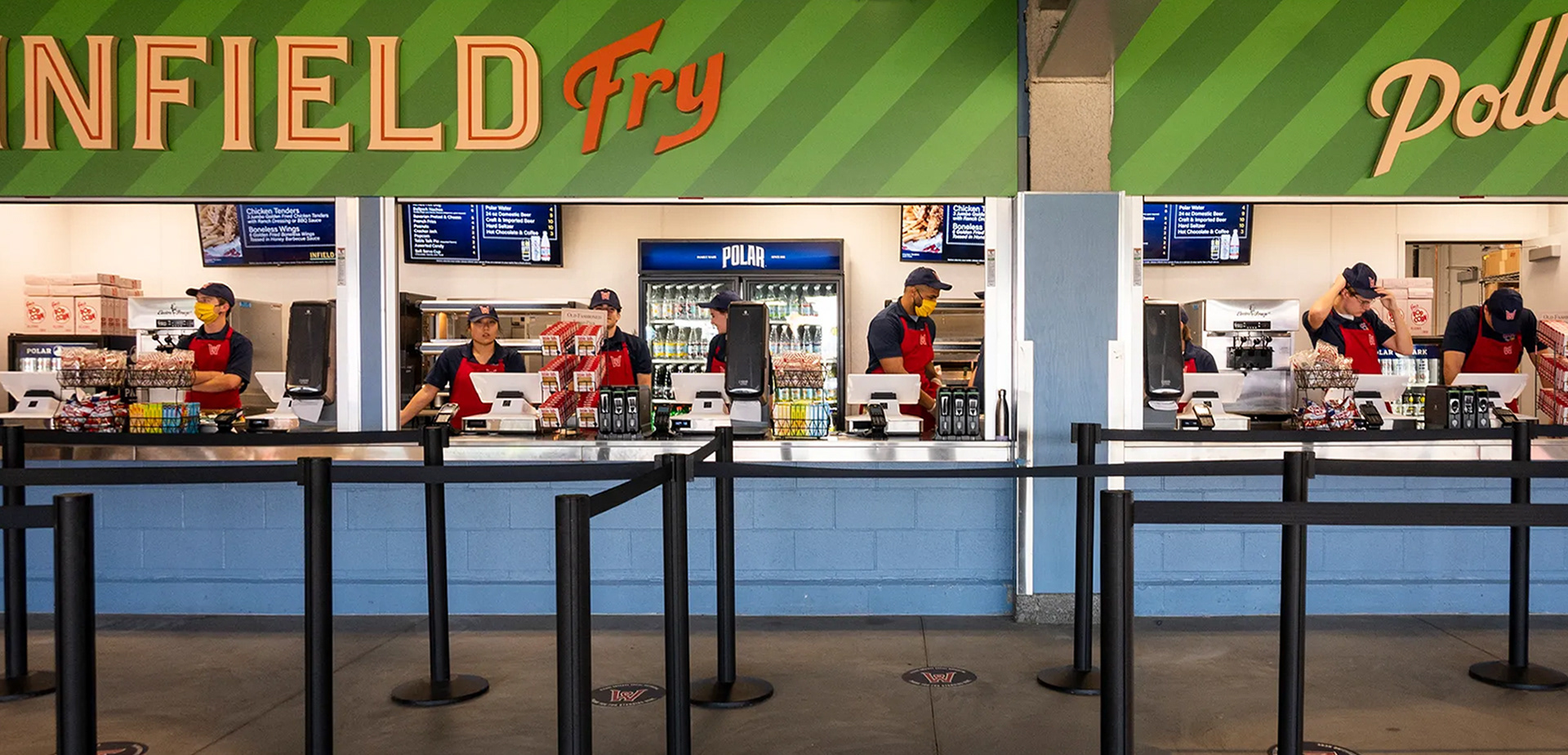
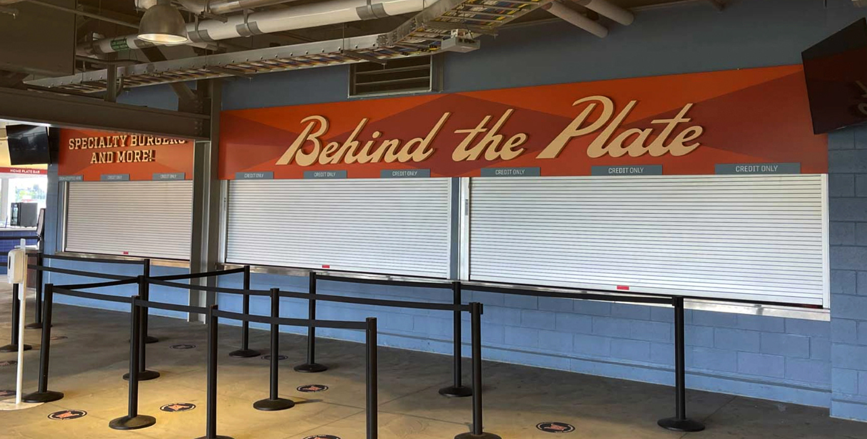
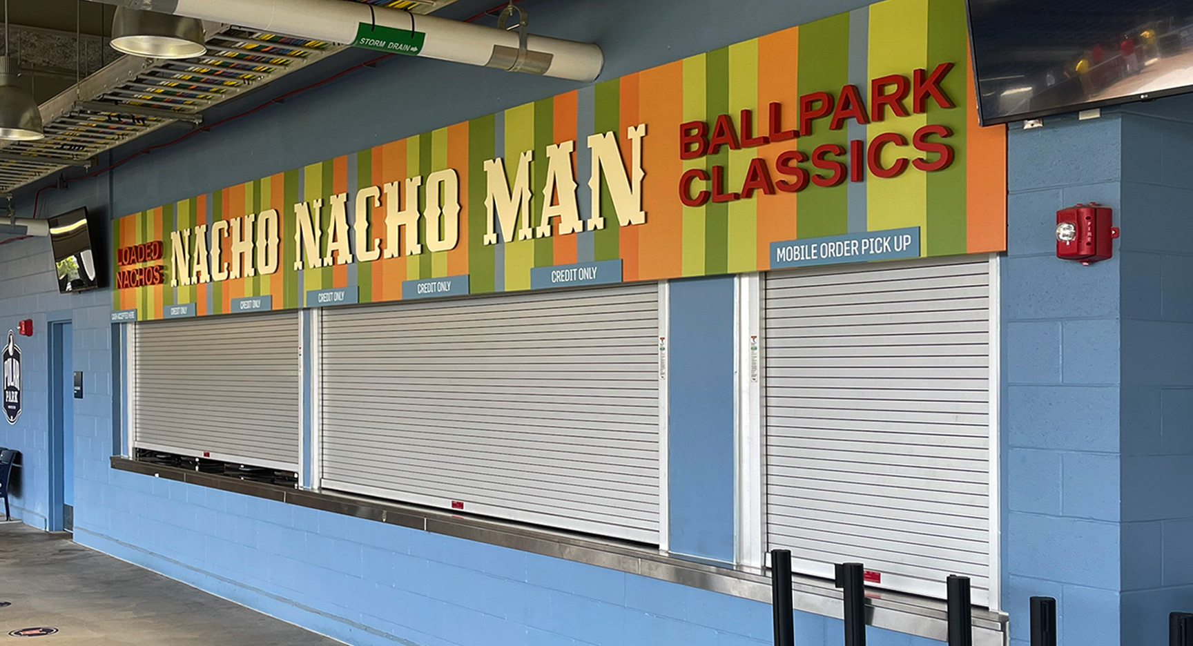
Custom Concession Typography
I drafted the character of every letter myself, creating each point and curve manually to achieve a specific quality rather than relying on existing fonts. For the Worcester typography, I reconstructed the Blackletter style by hand using site photography to accurately replicate the original building’s exterior signage. The other concession identities were developed as original designs to feel unique to that environment. This same process applies to the custom background patterns, confirming the entire graphic matches the brand's identity.
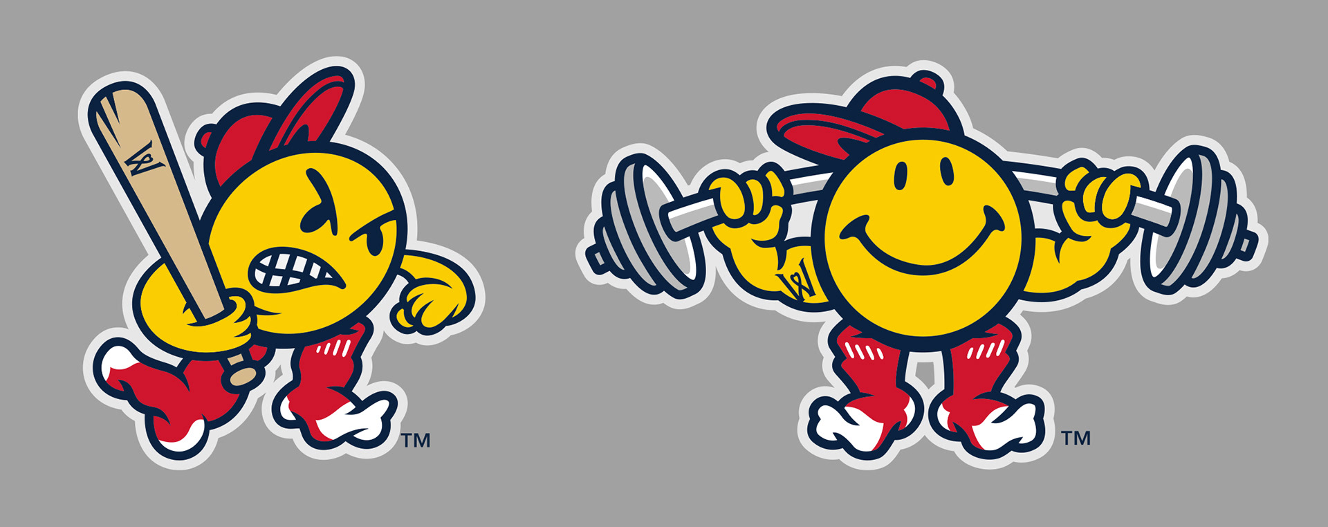
Mascot Development & Character Studies
This section shows the expansion of an existing team mascot into new, specialized character studies. Taking the original smiley character as a foundation, I was tasked with developing more aggressive and high-energy versions to reflect a competitive locker room and weight room spirit. These new iterations maintain the brand's core identity while introducing a level of grit and intensity tailored to the players' environment.
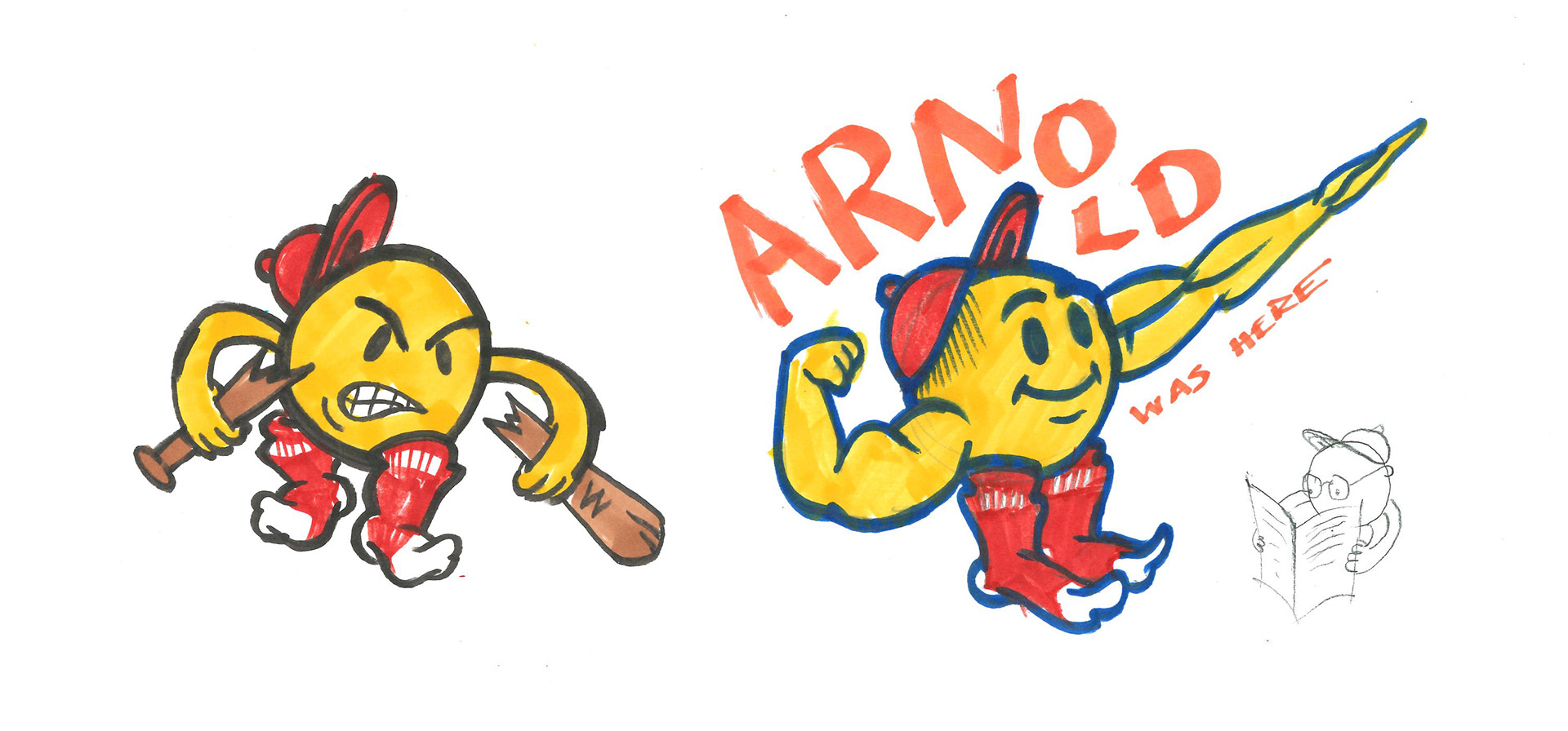
I’ve also included some of my internal process sketches, such as the bat-breaking and "Arnold" inspired studies. While these were created for personal enjoyment and to explore the limits of the character's form, they highlight my passion for drawing and the creative energy I bring to every project.
Project completed at Younts Design Inc.